 Cộng đồng blog chia sẽ kiến thức cộng đồng
Code Responsive Table in html css
Cộng đồng shop chào các bạn, Code Responsive Table là tạo bảng hiển thị được cả 2 thiết bị là desktop và mobi, có nhiều bạn làm được bảng nhưng trên mobi nó không hiển thị được và tràn ra layout, rất khó chịu, nên hôm nay AD viết bài này cho các bạn nào chưa biết để làm cho website đẹp hơn nhé.
Code Responsive Table In Css Html
-
-
-
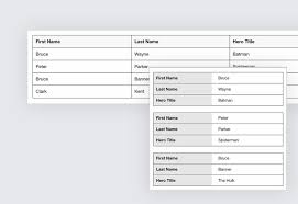
Html Code Responsive Table
<table> <caption>Statement Summary</caption> <thead> <tr> <th scope="col">Account</th> <th scope="col">Due Date</th> <th scope="col">Amount</th> <th scope="col">Period</th> </tr> </thead> <tbody> <tr> <td data-label="Account">Visa - 3412</td> <td data-label="Due Date">04/01/2016</td> <td data-label="Amount">$1,190</td> <td data-label="Period">03/01/2016 - 03/31/2016</td> </tr> <tr> <td scope="row" data-label="Account">Visa - 6076</td> <td data-label="Due Date">03/01/2016</td> <td data-label="Amount">$2,443</td> <td data-label="Period">02/01/2016 - 02/29/2016</td> </tr> <tr> <td scope="row" data-label="Account">Corporate AMEX</td> <td data-label="Due Date">03/01/2016</td> <td data-label="Amount">$1,181</td> <td data-label="Period">02/01/2016 - 02/29/2016</td> </tr> <tr> <td scope="row" data-label="Acount">Visa - 3412</td> <td data-label="Due Date">02/01/2016</td> <td data-label="Amount">$842</td> <td data-label="Period">01/01/2016 - 01/31/2016</td> </tr> </tbody> </table> -
Css Code Responsive Table
body {
  font-family: "Open Sans", sans-serif;
  line-height: 1.25;
}
table {
  border: 1px solid #ccc;
  border-collapse: collapse;
  margin: 0;
  padding: 0;
  width: 100%;
  table-layout: fixed;
}
table caption {
 font-size: 1.5em;
  margin: .5em 0 .75em;
}
table tr {
  background-color: #f8f8f8;
  border: 1px solid #ddd;
  padding: .35em;
}
table th,
table td {
  padding: .625em;
  text-align: center;
}
table th {
  font-size: .85em;
  letter-spacing: .1em;
  text-transform: uppercase;
}
@media screen and (max-width: 600px) {
  table {
   border: 0;
 }
  table caption {
    font-size: 1.3em;
  }
table thead {
    border: none;
    clip: rect(0 0 0 0);
    height: 1px;
   margin: -1px;
    overflow: hidden;
    padding: 0;
    position: absolute;
    width: 1px;
  }
  table tr {
   border-bottom: 3px solid #ddd;
    display: block;
    margin-bottom: .625em;
  }
  table td {
    border-bottom: 1px solid #ddd;
    display: block;
    font-size: .8em;
    text-align: right;
  }
  table td::before {
    /*
    * aria-label has no advantage, it won't be read inside a table
    content: attr(aria-label);
    */
    content: attr(data-label);
    float: left;
    font-weight: bold;
   text-transform: uppercase;
  }
  table td:last-child {
   border-bottom: 0;
  }
}
-
-
Vậy là xong, các bạn có thể check kiểm tra nhé, cũng có cách khác là khi chuyển sang di động là nó sẽ ko tràn ra Layout, Nó sẽ tự động chuyển thành thanh cuộn ngang, giống desktop cho mọi người dễ xem hơn, tùy các bạn chọn để có thể có 1 Responsive Table (Bảng hiển thị giao diện mobi) đẹp nhé,
DEMO: https://codepen.io/AllThingsSmitty/pen/MyqmdM
-
Cách Code Responsive Table hiển thị full chiều ngang hiện thanh cuộn
A responsive table will display a horizontal scroll bar if the screen is too small to display the full content:
Add a container element (like <div>) with overflow-x:auto around the <table> element to make it responsive:
Bạn thêm css overflow-x:auto vào trước 1 thẻ div table là được
<div style="overflow-x:auto;">

<table>
... table content ...
</table>

</div>
Các bạn có gì thắc mắc cứ liên hệ với mình hoặc để lại comment bên dưới, like face để có nhiều tin mới hơn nhé. mình sẽ hỗ trợ hết sức, thank you mọi người nhé!